Website mockup: how to see the design before you pay
How to see a website before you order it: sketch, Figma mockup, clickable prototype and the free builder. What not to judge, how to write feedback and 10 questions to ask when reviewing a mockup.
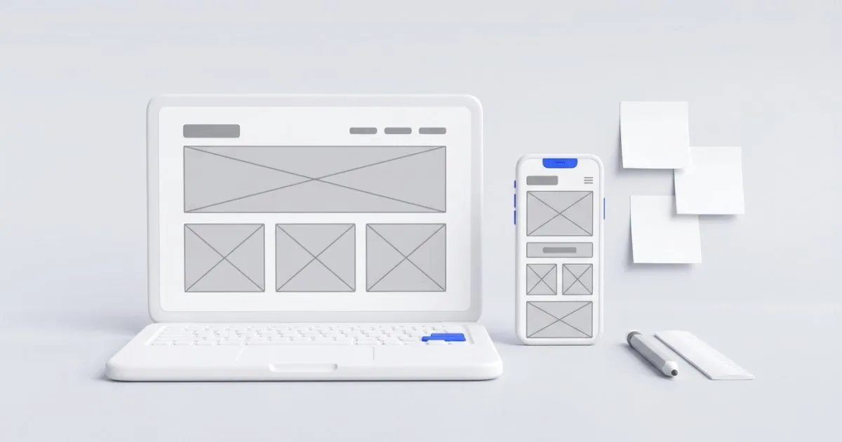
The most expensive change to a website is the one someone requests only after launch. Moving a section or adding a subpage on a mockup takes a moment, while in finished code it can take several hours. That is why a website mockup is the cheapest moment to change your mind.
In this guide I show how to see a website before you pay for building it: how a sketch differs from a mockup and a prototype, what to ask for at each stage, what not to judge, and how to write feedback so the developer understands it the first time. You also get a list of 10 questions to ask while reviewing the design.
Sketch, mockup, prototype and builder: four ways to preview a website
These terms are sometimes used interchangeably, so at the start of the collaboration ask what exactly you will get. The stages differ in the level of detail and in what you can judge at each of them.
| Stage | What it looks like | What you judge | What to ask for |
|---|---|---|---|
| Sketch (wireframe) | Gray rectangles and labels, no colors or photos | The order of sections, the list of subpages, the place for the phone number and the form | A list of subpages, a sketch of the home page and of one typical subpage |
| Visual mockup | The final look: colors, typefaces, photos, buttons, most often in Figma | Readability, character, consistency with the brand | A link to the design with commenting enabled, a desktop version and a phone version |
| Clickable prototype | A mockup in which the menu and buttons work | The customer’s path from landing on the website to contact | A link you can open on your own phone |
| Draft in the builder | A real website with texts written by AI | Whether a simple website is enough to start with | A few subpages to edit and download |
Not every project needs all the stages. With me, the mockup and the visual design are created together in Figma, straight away in a desktop and a phone version, so you see the website before a single line of code is written. A clickable prototype makes the most sense when the website has more than ordinary subpages: a multi-step form, a calculator or bookings. For a simple business website, a good mockup is usually enough.
What you should receive before you approve the design
A mockup shown once at a meeting, without a link, is not enough. Before you approve, it is worth having:
- a link to the design that you can open yourself, at any time, also on a phone,
- a phone version of every important subpage, not only the home page,
- a list of subpages with a short description of what will be on each,
- information on where the texts and photos will come from: from you, from the developer or from a stock photo library,
- the number of revision rounds written into the offer,
- for a redesign: a list of the old addresses and information on where they will lead after the change. Otherwise the subpages that bring traffic from Google today may simply disappear.
Also ask what happens to the design if you don’t continue after the mockup stage: whether you get the file and the right to use it. That is a matter for the contract, not for a verbal promise. It is good when payment is split into stages and approval of the mockup is one of them. What else to look at in an offer is described in the guide How much does a website cost in 2026.
What not to judge on a mockup
Some elements of a mockup are only filler. If you focus on them, you will use up a revision round on things that will change anyway.
- “Lorem ipsum” text. This is pseudo-Latin placeholder text that only shows how much space the content will take. Judge the length and the layout, not the meaning. If your real text will be three times longer, say so right away, because it will change the layout of the sections.
- Stock photos. They often end up on a mockup only as a trial. On services such as Adobe Stock, the preview carries a watermark that disappears only after you buy the license. Agree whether the website will use your own photos of completed projects or purchased ones, and who pays for the licenses.
- Sample numbers and reviews. “15 years of experience” or “500 satisfied customers” on a mockup is usually filler. Make sure your real data appears there before publication.
- The exact shade of a color. Every monitor and phone shows colors a little differently. If you have brand colors, give their codes instead of judging “by eye”.
What you should judge on a mockup is the order of the content, readability, whether it is immediately clear what the company does, and how easy it is to contact it.
Check the mockup on a phone, not only on a computer
A mockup is usually viewed on a large monitor. Your customers will often see the website on a phone: on a work break, in a queue or on a construction site.
Google, too, looks primarily at the phone. In its documentation for site owners, Google writes that it uses the mobile version of a page for indexing and ranking. Content that is missing from the phone version is not taken into account in indexing.
How to check a mockup on a phone:
- Ask for a link to the mobile version or to the prototype. You can open a Figma prototype link in your phone’s browser, or more conveniently in the Figma app for iOS and Android (the app requires an account).
- View the design at its real size, with the phone in one hand. On a monitor everything seems bigger and more readable.
- Check the first screen: whether, without scrolling, you can see what you do and a button to call.
- Walk through the customer’s path: from the menu to a service, from the service to the form. Count the clicks.
With me, the design covers a desktop version and a phone version, and before launch I test the finished website on real phones.
10 questions to ask when reviewing a mockup
Print this list or open it next to the design. For each question, write down the answer in one sentence.
- After a few seconds on the home page, do I know what the company does and in which city or region?
- Is a phone number or a contact button visible on the first screen of a phone?
- Does every subpage have one main button that says what to do next?
- Are all the services I want to sell there, in order from the most important?
- What will someone see who lands from Google straight on a service subpage, skipping the home page?
- Where is the proof: reviews, photos of completed projects, certificates, warranty?
- How does the menu work on a phone, and how many clicks separate the customer from the form?
- Does the form ask only for what I really need for a quote, and what will the customer see after sending it?
- Who will prepare the texts and photos, by when and for how much?
- What is not yet in the mockup: the footer, the privacy policy, the cookie banner, form error messages, a 404 page?
Questions 1–3 are the most important. If you answer “I don’t know” to any of them, you have your first comment for the developer.
How to write feedback so the developer understands it
“I don’t like it” is the most common comment and the least useful. The developer doesn’t know what to change, so they guess, and you get another version that doesn’t fit either. A good comment has four parts: where, what it is now, what it should be and why. A template to copy:
- Where: Offer, phone version, pricing section.
- Currently: three packages side by side, prices hard to read.
- Should be: packages one under another, the middle one on top.
- Why: customers most often ask us about the middle package.
A few “instead of X, write Y” examples:
- Instead of “the headline is weak” write: “The headline talks about quality, while customers mainly ask about the lead time. I suggest: ‘Turnkey bathrooms in 6 weeks, Kraków and the surrounding area’.”
- Instead of “make it more modern” write: “I like the website [link]: large photos of completed projects and little text on the first screen. Can we lay out the home page that way?”
- Instead of “the color is wrong” write: “The button blends into the background photo. Please use the orange from our logo or stronger contrast.”
- Instead of “move it higher” write: “On a phone, the phone number should be visible without scrolling.”
Three rules that save revision rounds:
- One list per round. Collect comments from everyone in the company and send them together, numbered. Ten emails with one comment each is a sure path to mistakes.
- A comment pinned to a place. In Figma on a computer you turn on comment mode (the C key) and click the spot the comment refers to. Without Figma, a screenshot with an arrow will do.
- “Must” separated from “nice to have”. Then the developer knows what is a condition of approval and what is only a suggestion.
How many revisions are normal? More important than the number itself is that it is written into the offer and that it is clear what a round is: one compiled list, not every single message. With me, two revision rounds are included in the price of the design. Minor changes after approval are normal, but a new layout or a new subpage once the website is already in code is usually extra work, priced separately.
A free draft in the builder before you order anything
If it is hard for you to imagine a website from gray rectangles, start with something real. In my free website builder you fill in a form in 2–3 minutes, and the AI (Google Gemini) writes, in about 10–20 seconds, a website with four subpages: home, offer, about the company and contact. You add a logo, photos, your brand color and typeface, and choose a light or dark background.
You edit the texts in the browser: you click a sentence and type. The builder highlights sentences with numbers and promises for you to check, and the “Napisz inaczej” (“Rewrite”) button writes a section anew (up to 3 times per website). The draft waits for 7 days from the last change, but no longer than 30 days. The builder and the files are free, with no subscription. The only condition is the credit “Wykonanie: RobimyWeb” (“Built by RobimyWeb”) in the footer, and you pay only for the domain and hosting.
Such a draft is useful in two ways. If a simple website is enough, you have it right away. If not, you already know which subpages, texts and photos you need, so the conversation about a custom project goes faster. Remember that the downloaded website has no editing panel, and an online store, bookings, a quote calculator or many subpages for services and cities are already a job for a custom-built website. I describe the builder step by step in the guide A free website for your business.
Summary
A mockup is the cheapest moment to change your mind. Ask for a link with a phone version, don’t judge placeholder text or stock photos, go through the 10 questions and write feedback using the template: where, currently, should be, why.
If you are planning a new website, the Turnkey business website (from PLN 4,900 net) gives you a design in Figma for desktop and phone and two revision rounds before I write the first line of code. If you want to refresh an old website, see website redesign (from PLN 2,900 net). Write to me: you will get a quote within 24 hours, and new customers get a 20% discount on their first order.
Frequently asked questions
Usually yes, because a good visual design takes several days of work. With me, the mockup is part of the website quote, and the first conversation and the quote are free. You can make a free preview of a simple website yourself in my builder.
There is no single standard; what matters is that the number of rounds is written into the offer. With me, two rounds are included in the price of the design. A round is one compiled list of comments, not every single message.
A mockup shows what the website will look like, but it is a static image. In a prototype you click the menu and buttons, so you can check the customer’s path to contact. For a simple business website, a mockup is usually enough.
You don’t need to install anything: you open the link to the design or prototype in a browser, also on a phone. To leave comments you usually need to create a free Figma account, and the Figma mobile app also requires an account.
It depends on the number of subpages and whether the texts are ready. With me, the design stage, meaning the mockup and the visual design in desktop and phone versions, usually takes 1–2 weeks. Ready-made texts and one compiled list of comments save the most time.
Related services
Have a similar project?
Describe what you need and I’ll send a quote within 24 hours. New clients get 20% off their first project.