Mega menu step by step: HTML, CSS and JavaScript with accessibility
How to build a mega menu: HTML, CSS and JavaScript code to copy, keyboard and screen reader support, a phone version, common mistakes and a demo.
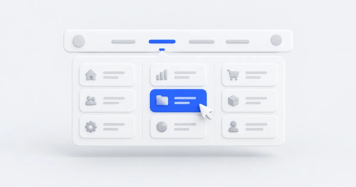
A mega menu is a large panel that unfolds from the top menu and shows several groups of links at once, often with short descriptions. You know it from online stores and from the websites of companies with a broad offer. Done well, it shortens the customer’s path to a specific service. Done badly, it closes before the cursor reaches it, doesn’t work on a phone and can’t be operated with a keyboard.
In this tutorial we will build a mega menu from scratch: HTML, CSS and about 30 lines of JavaScript, with no library. I tested the code in a browser, and you can open a working demo here. The same pattern runs in my own menu: the “Free tools” button at the top of this page.
When a mega menu makes sense
A mega menu is useful when:
- in one part of your offer you have more than 7–8 subpages, for example several kinds of services in several groups,
- your offer naturally divides into categories (a store, a construction company, an accounting office with services for different clients),
- you want to show a short description next to the links or a single highlighted call to action.
If the whole website has 5–6 subpages, an ordinary menu is enough. A mega menu with three links looks empty and only makes the code longer.
How a good mega menu should work
Before you start writing code, set the rules. Each of them has a reason:
- It opens on click, and from the keyboard with the Enter key or the spacebar. Hover alone doesn’t work on a phone.
- It closes when you click elsewhere, with the Escape key, and when you tab past it.
- A screen reader knows whether the panel is expanded thanks to the
aria-expandedattribute. - The links are ordinary
<a>tags in HTML, so Google sees all the subpages. - There is no gap between the button and the panel in which the cursor “loses” the menu.
- On a phone the panel turns into a dropdown list under a “Menu” button.
- The groups have headings, and the whole panel has at most one highlighted call to action.
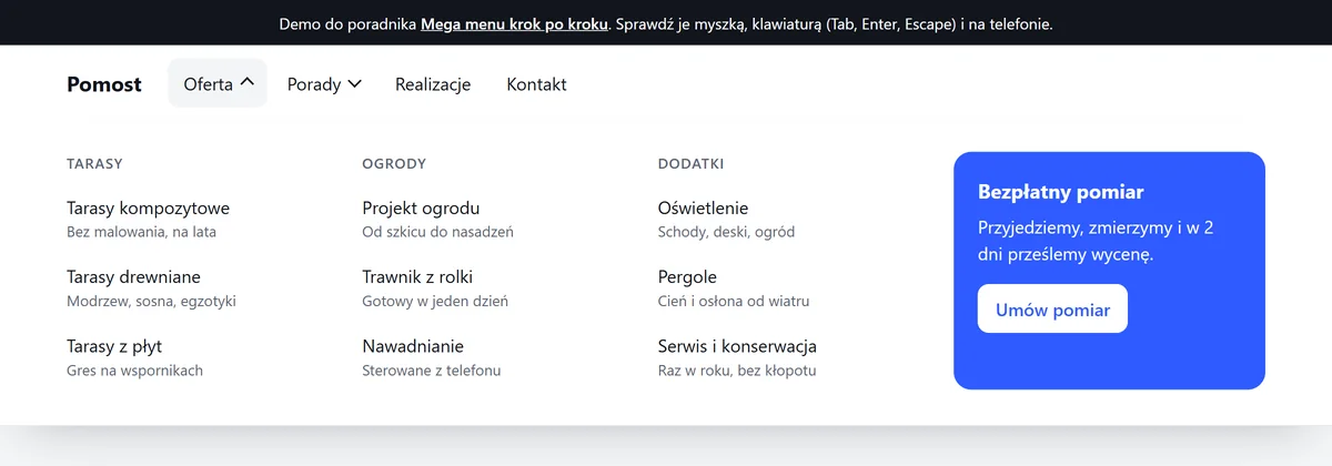
Step 1: HTML
Each expandable item is a button and a panel. A button rather than a link, because it doesn’t open anything at a new address, it only shows the panel. The aria-controls attribute points to the panel, and hidden hides it at the start:
<header class="top">
  <div class="top__in">
    <a class="logo" href="/">Pomost</a>
    <button class="burger" type="button" aria-expanded="false" aria-controls="menu">Menu</button>

    <nav class="nav" id="menu" aria-label="Menu główne">
      <ul class="nav__list">
        <li>
          <button class="nav__toggle" type="button" aria-expanded="false" aria-controls="mm-oferta">Oferta</button>
          <div class="mega" id="mm-oferta" hidden>
            <div class="mega__in">
              <div>
                <p class="mega__title" id="mm-tarasy">Tarasy</p>
                <ul aria-labelledby="mm-tarasy">
                  <li><a href="/tarasy-kompozytowe">Tarasy kompozytowe<small>Bez malowania, na lata</small></a></li>
                  <li><a href="/tarasy-drewniane">Tarasy drewniane<small>Modrzew, sosna, egzotyki</small></a></li>
                </ul>
              </div>
              <!-- more columns: Gardens, Accessories -->
              <div class="mega__promo">
                <b>Bezpłatny pomiar</b>
                <p>Przyjedziemy, zmierzymy i w 2 dni prześlemy wycenę.</p>
                <a href="/kontakt">Umów pomiar</a>
              </div>
            </div>
          </div>
        </li>
        <li><a href="/realizacje">Realizacje</a></li>
        <li><a href="/kontakt">Kontakt</a></li>
      </ul>
    </nav>
  </div>
</header>
The group heading is an ordinary paragraph, and the list is tied to it through aria-labelledby. A screen reader then announces “Tarasy, list, 3 items”, and a dozen or so extra H2s don’t appear in the page’s heading structure.
I often come across role="menu" and role="menuitem" in such menus. That is a mistake: these roles are intended for application menus (like “File, Edit” in an editor) and promise arrow-key support that an ordinary website doesn’t have. For navigation, the WAI-ARIA Authoring Practices recommend precisely the “disclosure” pattern, that is, a button that shows and hides content.
Step 2: CSS
Three things matter most: the panel sits flush against the header with no gap, the look of the button depends on aria-expanded, and keyboard focus is clearly visible:
.top { position: relative; background: #fff; }
.nav__list { display: flex; gap: 4px; margin: 0; padding: 0; list-style: none; }
.nav__toggle { display: inline-flex; align-items: center; gap: 8px; padding: 10px 14px;
  border: 0; border-radius: 10px; background: none; font: inherit; cursor: pointer; }

/* the arrow rotates when the panel is open: the state is read straight from aria-expanded */
.nav__toggle::after { content: ""; width: 7px; height: 7px; border-right: 2px solid currentColor;
  border-bottom: 2px solid currentColor; transform: translateY(-2px) rotate(45deg); transition: transform .2s; }
.nav__toggle[aria-expanded="true"]::after { transform: translateY(1px) rotate(-135deg); }

/* full-width panel, starting exactly below the header (top: 100%, no margin) */
.mega { position: absolute; left: 0; right: 0; top: 100%; z-index: 10; background: #fff;
  box-shadow: 0 24px 40px -24px rgba(17, 21, 28, .25); }
.mega__in { max-width: 1120px; margin: 0 auto; padding: 28px 20px 32px;
  display: grid; grid-template-columns: repeat(3, minmax(0, 1fr)) minmax(0, 1.2fr); gap: 32px; }
.mega ul { margin: 0; padding: 0; list-style: none; }
.mega ul a { display: block; padding: 8px 10px; border-radius: 10px; text-decoration: none; }
.mega ul small { display: block; color: #5b6472; font-size: 13.5px; }

:focus-visible { outline: 3px solid #2f5bff; outline-offset: 2px; }

/* a short entrance of the panel, but not for people who have turned off animations in their system */
@media (prefers-reduced-motion: no-preference) {
  .mega:not([hidden]) { animation: wjazd .18s ease-out; }
}
@keyframes wjazd { from { opacity: 0; transform: translateY(-6px); } }
Note the minmax(0, 1fr) in the grid. Without it, a long word in a column can push the panel wider than the screen.
Step 3: JavaScript
The script does four things: it opens and closes a panel on click, closes the other panels, handles Escape, and closes the menu when you click elsewhere or tab out of the menu:
const nav = document.querySelector('.nav');
const toggles = [...nav.querySelectorAll('.nav__toggle')];

function setOpen(btn, open) {
  btn.setAttribute('aria-expanded', String(open));
  document.getElementById(btn.getAttribute('aria-controls')).hidden = !open;
}
function closeAll(except) {
  toggles.forEach((b) => { if (b !== except) setOpen(b, false); });
}

toggles.forEach((btn) => btn.addEventListener('click', () => {
  const open = btn.getAttribute('aria-expanded') !== 'true';
  closeAll(btn);
  setOpen(btn, open);
}));

// Escape closes the open panel and returns to its button
nav.addEventListener('keydown', (e) => {
  const btn = toggles.find((b) => b.getAttribute('aria-expanded') === 'true');
  if (e.key === 'Escape' && btn) { setOpen(btn, false); btn.focus(); }
});

// a click outside the menu and moving focus to an element outside the menu close the panel
document.addEventListener('click', (e) => { if (!nav.contains(e.target)) closeAll(); });
document.addEventListener('focusin', (e) => { if (!nav.contains(e.target)) closeAll(); });
The menu’s state is stored in one place: in the aria-expanded and hidden attributes. CSS reads it to rotate the arrow, a screen reader to announce “expanded” and “collapsed”, and the script to decide what to close. There are no separate classes such as is-open that could drift out of sync with what a blind person hears.
A curiosity from testing: the first version closed the menu on the focusout event. It worked from the keyboard, but the panel disappeared when you clicked its background, because the browser then removes focus from the button. The focusin event on the whole document reacts only when focus actually lands on another element, so it doesn’t have this problem.
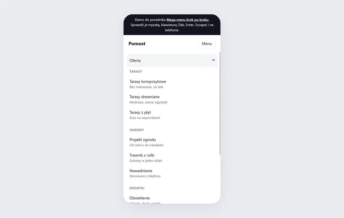
Step 4: the phone version
There is no room for four columns on a phone. We turn the same HTML into a dropdown list: the navigation hides behind a “Menu” button, and the panels stack one under another:
.burger { display: none; }
@media (max-width: 860px) {
  .burger { display: inline-flex; margin-left: auto; padding: 10px 14px;
    border: 1px solid #e3e6eb; border-radius: 10px; background: none; font: inherit; }
  .nav { display: none; position: absolute; left: 0; right: 0; top: 100%; z-index: 10;
    max-height: calc(100dvh - 68px); overflow-y: auto; background: #fff; }
  .nav.is-open { display: block; }
  .nav__list { flex-direction: column; padding: 8px 12px 16px; }
  .nav__toggle { width: 100%; justify-content: space-between; padding: 14px 12px; }
  .mega { position: static; box-shadow: none; }
  .mega__in { grid-template-columns: minmax(0, 1fr); gap: 20px; padding: 8px 12px 16px; }
}
const burger = document.querySelector('.burger');
burger.addEventListener('click', () => {
  const open = burger.getAttribute('aria-expanded') !== 'true';
  burger.setAttribute('aria-expanded', String(open));
  nav.classList.toggle('is-open', open);
});
max-height with the dvh unit and overflow-y: auto make it possible to scroll a long menu on a small screen, and the browser’s address bar on a phone doesn’t cover it.
How to test the menu in 5 minutes
Before you publish the menu, check it the way people will use it:
- Keyboard: use the Tab key to reach “Oferta” (Offer), Enter opens the panel, further Tabs move through the links, Escape closes the panel and returns to the button. Tab past the last link closes the panel.
- Mouse: move the cursor diagonally from the button to the panel and click an empty spot in the panel. The panel should stay open.
- Screen reader: in NVDA (Windows) or VoiceOver (Mac, iPhone) the button should sound like “Oferta, button, collapsed”, and after opening, “expanded”.
- Phone and zoom: at a width of 320 px and 200% zoom, nothing may stick out beyond the screen or force sideways scrolling.
- Lighthouse in Chrome (the Accessibility tab) will catch missing button names and too weak contrast.
You can check the overall state of a website, including accessibility, SEO and speed, in 30 seconds with my tool Check your website.
The most common mega menu mistakes
- A hover-only menu. It can’t be opened on a phone, and on a computer it opens by accident.
- A gap between the button and the panel. A
margin-top: 8pxis enough for the cursor to drop out of the menu on its way to the panel and for everything to close. <a href="#">instead of a button. The page jumps to the top, and a screen reader announces a link that leads nowhere.role="menu"without arrow-key support. A promise the page doesn’t keep is worse than no ARIA.- Links loaded by a script only after hover. Google may not see them.
- Too many links. A panel with 120 items is a catalog, not navigation. The customer searches for 2–3 seconds, and if they don’t find it, they go back to Google.
- A panel wider than the screen on a phone. The classic symptom: the page can be dragged sideways by a few pixels.
What about WordPress?
In WordPress a mega menu is usually provided by a theme or a plugin. Before you keep it, run the same test list: many plugins open the menu only on hover, don’t set aria-expanded and add dozens of kilobytes of scripts to every subpage. Sometimes it is simpler and faster to add your own menu based on the code from this tutorial.
Summary
A good mega menu is a button with aria-expanded, a panel with hidden, ordinary links in HTML and three ways of closing: a click elsewhere, Escape and Tab. On a phone, the same code works as a dropdown list. The full code from this article is in the demo: open it, try it with a mouse and a keyboard, and then view the page source.
If your website has a broad offer and the menu can’t keep up, write to me. I will rebuild the navigation in your current website or design a new business website. I reply within 24 hours, and new customers get a 20% discount on their first order.
Frequently asked questions
No, as long as the links are in the page’s plain HTML code rather than loaded only on mouse hover. Google then sees all the subpages. Don’t overdo the number of links, though: a dozen or so well-named items help, while several hundred dilute the signal about which subpages matter most.
Better on click. Hover doesn’t work on touch screens, and on a computer the menu opens by accident when the cursor merely passes over the header. If you want hover, add a delay of about 200 ms and keep clicking as the main way to open it.
The menu role is intended for application menus, such as “File, Edit” in a text editor, and requires arrow-key support. For website navigation, the WAI-ARIA guidelines recommend a simpler pattern: a button with aria-expanded that shows and hides a list of ordinary links.
A good rule is 3–4 columns and 3–8 links in each. If you need more, it is a sign that it is worth organizing your offer or adding a category page that the menu leads to.
Related services
Have a similar project?
Describe what you need and I’ll send a quote within 24 hours. New clients get 20% off their first project.